How will readers discover their friends are featured in a college magazine?
Project
Sarah Lawrence College
Magazine redesign
2007
Deliverables
- Print magazine redesign
- Improved navigation
Key Skills
- User research
- Experience design
Background
I was secretly an experience designer long before I ever knew what experience design was.
I served as the editor of Sarah Lawrence magazine, the flagship publication for a premier liberal art college in New York, from 2007 to 2014.
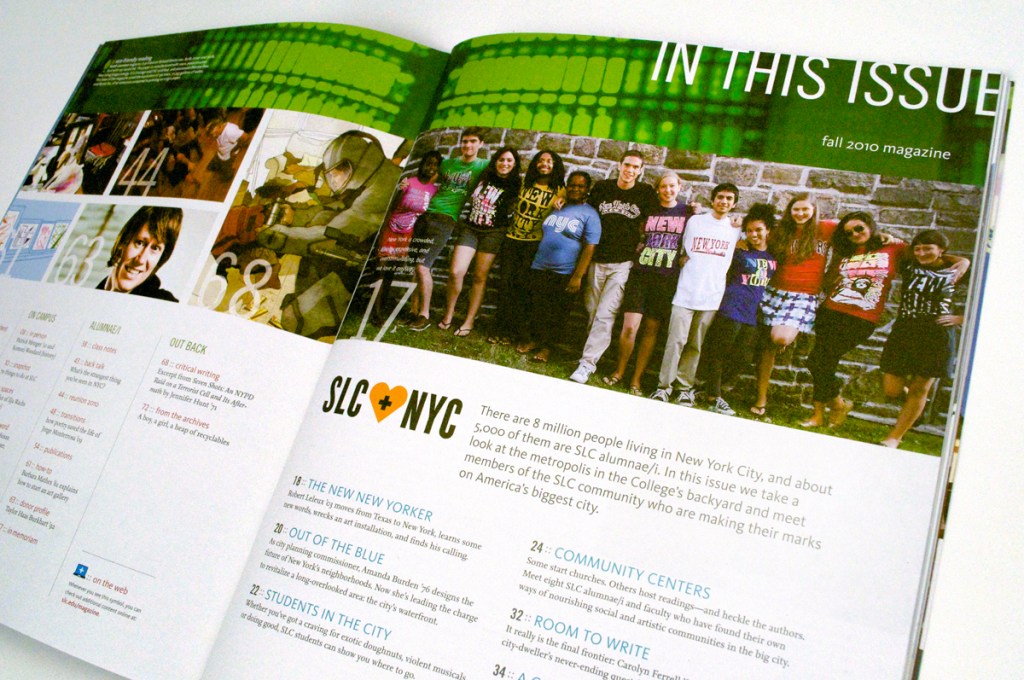
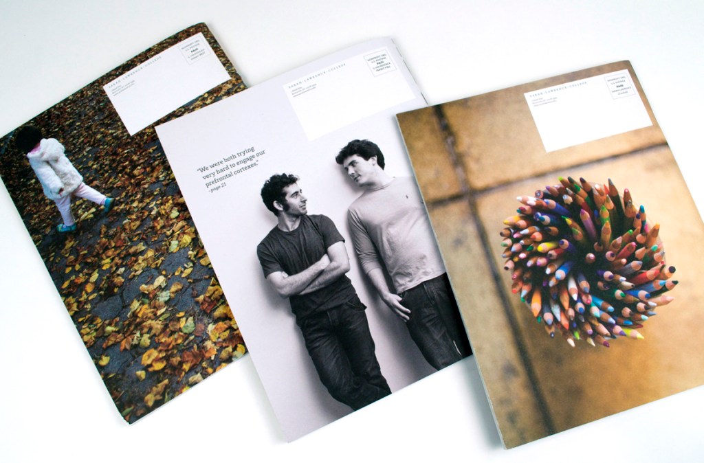
When I took the helm, the publication hadn’t been redesigned in years. I worked with the team at Taylor Design to reconsider every element of the magazine. Our goal: to make the magazine more authentically SLC— smart, edgy, and interdisciplinary.
Challenge
Many people browse a magazine from back to front. That’s doubly true for college magazines, because the back of the magazine is the home of Class Notes, where alumni write in to report on their lives. Class Notes were consistently reader’s favorite part of Sarah Lawrence.
From our surveys and conversations with our readers, we knew that Sarah Lawrence readers didn’t always notice when a classmate or friend was featured elsewhere in the magazine. This was a missed opportunity for both the reader and the College. The whole point of the magazine is to make people feel good about their alma mater, and nothing inspires pride like seeing a friend recognized in print.
What I Did
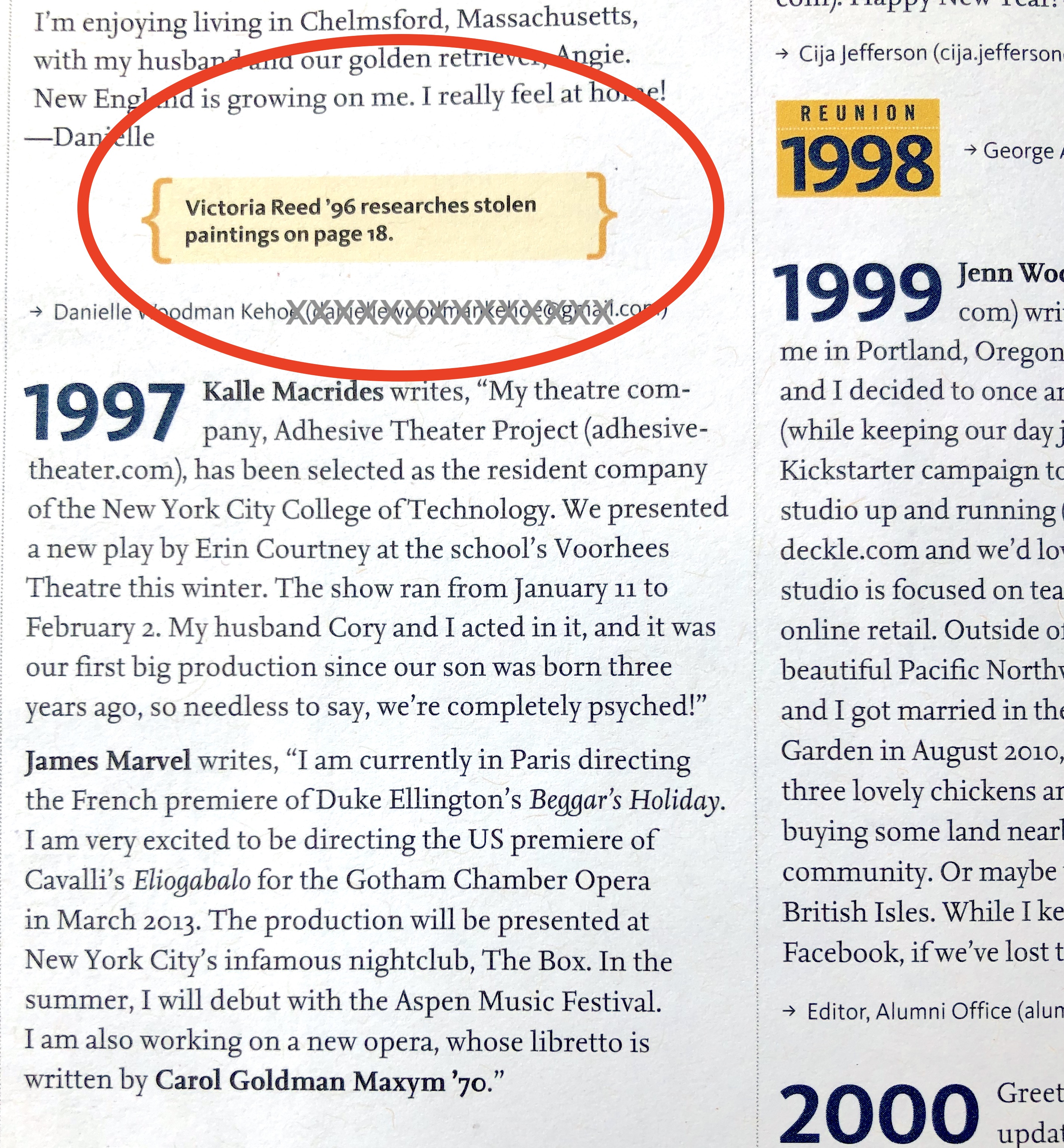
As part of the redesign, we added a widget within Class Notes that highlights any alumni from that class year who were mentioned elsewhere in the magazine.
This turns Class Notes into a de-facto table of contents, helping readers find the content that’s most interesting to them.
I had never heard of experience design when we introduced the Class Notes widget.
But it totally is. It’s an elegant solution that’s grounded in empathy for users’ real approach to the product. We designed a simple yet powerful way of meeting readers where they are.
Result
The redesigned magazine won the highest award from CASE, the professional body for university communicators: the 2008 Grand Gold award for excellence in periodical design. The magazine went on to win many other awards, but this is still the one I’m most proud of.
Looking back, the redesign process highlights the connections between experience design and communications strategy. Both rely on a nuanced understanding of your users, and both use creative collaboration to devise delightful solutions.
